People have been left gobsmacked after only just noticing a ‘hidden detail’ in the old F1 logo used between 1994 and 2017 – with some social media users amazed it took them 30 years to spot it
It’s the world’s most popular auto racing event, yet it took 30 years for some fans to notice a little detail in the old Formula 1 logo.
F1 began in 1950, combining the World Manufacturers’ Championship and the European Drivers’ Championship. It became known as Formula 1 for two reasons: the term ‘formula’ refers to the set of rules that govern car design, engine size, component usage, and other aspects. Furthermore, the ‘one’ just refers to the premier formula.
According to an F1 statement, Formula One began as a global championship competition in 1950, with the first race staged on May 13 at the Silverstone Circuit, a former Royal Air Force base in the United Kingdom.
“Six more events were held in a season that saw Alfa Romeo driver Giuseppe ‘Nino’ Farina win the sport’s inaugural world championship, defeating teammates Juan Manuel Fangio and Luigi Fagioli.
“While motorsport had been taking place since the late-1800s, with Grand Prix events growing in popularity across the following decades, 1950 marked the start of the official F1 championship that remains to this day.”
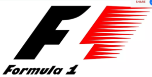
F1 has used four different logos over the years, and despite changing logos seven years ago, many people still talk about the 1994-2017 look.
One impressed Reddit user pointed out how its former emblem featured a ‘secret detail’ that they had taken decades to find, asking: “Is the F1 logo a flag with a ‘1’ in the center or is it a ‘F’ with a weirdly shaped ‘1’? Is it both? Seriously, for about eight years, I assumed it was a F and a 1, until I noticed the one in the middle. Is this done intentionally?”
One user commented: “I had the opportunity to study many F1 logos and GP poster ideas. Yes, the great thing about this logo is that the negative space between the F and the streaks is a one. The previous F1 logo employed negative space to symbolize an automobile.
A different individual responded: “Yes, that silhouette bit between the F and the right part of the logo is the ‘1’ in F1.” A third person commented: “So the real logo is the F and the middle one, and the rest of the logo is just some scribble with lines and stuff?” “That was the last thing I thought!”
Another person commented: “If you look at the whole logo with the words underneath, you’ll notice that the Fs and 1s in the logo and the words utilize the same typeface. The genuine one is in the middle. “Your eight years have been lies.”
Read more news on:https://sportupdates.co.uk/
Leave a Reply